Here are some common mistakes in user interface design that particular
annoy Dr. Dalbey
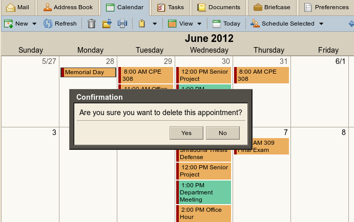
It doesn't tell me what is about to be deleted and it doesn't tell what are the implications or consequences of deleting. So how am I supposed to know if I should proceed or not?
Better version 1: "Are you sure you want to delete the appointment 'Lunch with Jeff.' If you do you will not receive a reminder. This action can not be undone."
Better version 2: Have a third button "Tell me more" which has a
complete
explanation of what is about to happen and describes the options
available
to the user.
"Invalid date format. Please enter the date in a valid format."
Why is this stupid? Because if I knew what a valid date format was I would have entered that way in the first place. The fact that I got this error means I obviously don't know what a valid format is. So this error message does nothing to help me correct the problem. Good error messages always suggest what corrective action is necessary.
Better: "The date you entered "10/25/02" is not valid. Please
specify the year as a four-digit year between 1980 and 2099, e.g. 2002.
Example 2: (see photo)
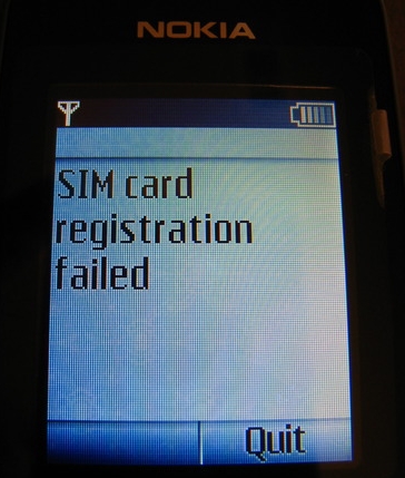
Assuming I happen to remember that the "SIM card" is the tiny piece of
plastic the salesperson inserted into the back of the phone when I
purchased it, "registration failed" is meaningless to 99% of
users.
Importantly, it gives me no clue about how to fix the problem,
even though there is clearly more room on the screen for an
explanation. Is the card not plugged in? Is the phone not finding
an expected card? Does the card not match the software version? Is
there a problem with the phone service?
Confusing user registration dialog
I'm about to register for some web-based service and a dialog
prompts me with "Enter username." This is very confusing to me
because I haven't signed up yet so I don't know what my username
is. It should say "Please choose a username you would like to
register" or some similar explanatory prompt. And there should
always be an option to ask for clarification if I still don't
understand.
Identical Save and Restore dialogs
If you were designing the control panel for a nuclear reactor would
you place the button that lifts the dampening rods out of the reactor
right next to the button that lowers the rods down into the
reactor? I hope not. These are VERY different functions so
the activating buttons should be very far apart and look very
different.
The same with Save and Restore dialogs. They do entirely opposite
things so they should look very different from each other. I hate
when the Save and Restore functions in a program use exactly the same
file chooser dialog distinguished only by a minor change in the title
bar. In a rush I restore a bad copy into my current document and
lose all my work.
What's wrong with the buttons in this screen?